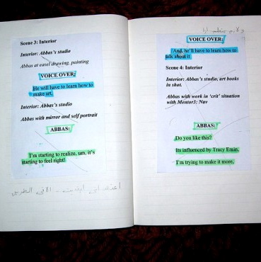
Formatting a VO Script: For a voice actor like you, the last thing you would want to experience is spending a lot of time trying to figure out a script. Let’s face it. There are employers who provide scripts that are very hard to read and understand. The letters in the script are small and poorly spaced out which makes it hard to read. There are no clear punctuations that help you to speak it the way it should be.
Sometimes, the script can be the cause of misunderstanding between an employer and a voice actor. So, it is very crucial to be very prudent in the format of a script. As a voice actor, it is completely professional to ask your employer that you receive a properly formatted script. To guide you, here are a few points to look at.
Travis, a voice over talent famous online, released a newsletter that included some tips to consider which was featured in a blog of a world-renowned consultant named Larry Jordan.
(1) Double Space your script.
Double spacing allows your talent to make corrections or notes between the lines. Double spacing is also easier to read.(2) Use a Font With Serifs.
Fonts come in two basic styles – serif and sans serif. The “serifs” on the Times Roman font are there to guide the eye and make the text easier to read. Helvetica or Arial fonts (sans serif) are intended to be used as titles. While Helvetica or Arial looks cleaner, with a more “graphic” look, it’s actually harder to read. This font (Times Roman) has serifs. This one (Arial) does not. This is the standard Font for Hollywood scripts. -12-point Courier, which is a serif font.(3) Write Out Loud.
Be sure your writer actually speaks the words as they write. Otherwise the words will be written for the eye, instead of for the ear.(4) Don’t write in all caps.
Many years ago, the teletype machines used in radio and TV stations didn’t have lower case characters, so the copy that the talent read was always in capital letters. As a result, some people mistakenly thought that the scripts were written all in uppercase because they were easier to read–a belief that has persisted to this day. This is wrong. Capital letters inform the reader that a sentence has started, that a particular noun is a proper one, or that a group of words is actually a title.(5) Be careful with run-on sentences.
In written text, if a sentence is complicated, we can easily go back and re-read that sentence if we don’t understand something. That’s difficult to do with the spoken word. Also, when a sentence is long, your voice talent might need to take a breath mid-sentence, which disturbs the flow and the listener’s comprehension. Always keep your sentences as short and direct as possible.
Another voice actor, Shelley McIntyre, almost has the same thoughts about formatting scripts for voice actors:
Most voice actors have shown up for a session to receive a script written in 9 point font. Working from a script like this hurts our eyes and makes it hard to read ahead. For your editing, of course you can use whatever size font you’d like. But the script you hand to a voice actor should feature at least a 12pt font in a normal looking black typeface. Serif fonts like Times New Roman are often easier to read than sans-serif fonts like Arial. Receiving a script with text in a 14 point font feels like Christmas.
Please double-space your scripts. Even with a larger font, lines smashed together are hard to read. Many times we’ll need to make notes on the script during a session, and we need that space between lines for our own marks.
Even though it may seem like a script in all caps is easier to read, it is not. Use regular sentence case throughout your script.
It is very true that a properly formatted script is a must for every voice actor. It makes work less of a hassle and done in time. Do you think these tips help you as a voice talent? Do you have more points to add to this list? Comment now!

